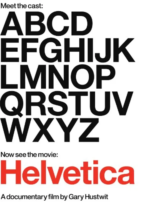
Helvetica
Helvetica
2007 · Documentary · UK
1h 20m · G
![[내부] 구독권 할인 프로모션 보드배너_2차](https://an2-img.amz.wtchn.net/image/v2/cmXSAF5yif3gxCGJX21oxg.png?jwt=ZXlKaGJHY2lPaUpJVXpJMU5pSjkuZXlKd0lqb2lMM1l5TDNOMGIzSmxMM0J5YjIxdmRHbHZiaTh4TmpZeU1EVXpOVFUyT0RBMk1qSXpJbjAucFhmb2g5YlZwaEJpV0w1SUpZUU5ObG9aMWxfNml2QzV3bVljNjhiWVZidw==)
![[내부] 구독권 할인 프로모션 보드배너_2차](https://an2-img.amz.wtchn.net/image/v2/4_7LYNxBgYhErgEg4020dw.png?jwt=ZXlKaGJHY2lPaUpJVXpJMU5pSjkuZXlKd0lqb2lMM1l5TDNOMGIzSmxMM0J5YjIxdmRHbHZiaTh4TkRBeE5qVXhNamMxTmpZeE1UZzRJbjAuMWlIRkgwVXN5aV9mTFNzU0E2cmtuQ1BGMGRIVkhfT1hYWDk2bWE5SHpDbw==)
Helvetica is a feature-length independent film about typography, graphic design and global visual culture. It looks at the proliferation of one typeface (which will celebrate its 50th birthday in 2007) as part of a larger conversation about the way type affects our lives. The film is an exploration of urban spaces in major cities and the type that inhabits them, and a fluid discussion with renowned designers about their work, the creative process, and the choices and aesthetics behind their use of type.
Lee Yoonam
4.0
우리나라 간판 만드는 사람이나 지자체 공무원들이 꼭 봐야할 다큐. 오 제발! 그렇게 오만 가지 폰트로 간판을 만들어 바둑판처럼 붙여 놓으면 가독성이 더 떨어지고, 하나 하나는 예쁠지 몰라도 미관을 도리어 해친다는 사실!
staymil
4.0
모든 것은 디자인이다. 스마트폰 시대에서 서체는 더더욱 그렇다. 가장 기초적인 water가 되어버린 Helvetica.
그날이오면
4.0
디자인 다큐멘터리는 좀 많이 나와야 한다.
Carol
4.0
서체 뿐 아니라 영화 자체의 입장도 중립적이어서 내게도 생각의 기회가 주어졌다.
Jungmin Lee
4.5
디폴트가 되어버린 그래서 건재한
mona.is.lavender
4.0
"You can say 'I love you' in Helvetica. And you can say it with Helvetica Extra Light if you want to be really fancy. Or you can say it with the Extra Bold if it's really intensive and passionate, you know, and it might work." 무슨 글꼴을 쓸지 고민이 될 때, 헬베티카를 써 보면 그 답이 보일 것이다. 무한한 가능성과 아름다움, 균형을 동시에 지닌 최적의 서체.
폴구
4.5
영화가 접근하는 방법이 좋다. 각계각층의 디자인 전문가들이 바라보는 헬베티카에 관한 생각을 담아냈다. 헬베티카를 근본주의로 놓고 다른 근본주의에 관해 이런 방식으로 사유해 본다면 어떨까?
팁트로닉
4.0
무엇을 적느냐가 아닌, 어떻게 읽히느냐의 문제.
Please log in to see more comments!